Data Categorisation Tool
Client
Telstra (2016)
Product team
1x Lead Product Designer and Consultant (me)
1x Lead Product Manager and Consultant
2x Lead Software Engineer and Consultant
1x Client Product Manager
1x Client Product Designer
2x Client Software Engineer
Opportunity
70,000 Telstra small business customers exceed their mobile data allowance each month, with 40.2% exceeding for the first time. These customers are having to pay excess data charges for each gigabyte they’ve gone over by. And with a 48-hour delay in excess data notifications and a paper bill that arrives 2 weeks after the end of the billing cycle, it becomes very easy for phone bills to skyrocket due to excess data charges without the customer knowing or being able to do anything about it. With no self-serve solution to understand how they went over, customers experience bill shock and call the customer service centre, costing Telstra millions in dollars in refunds to disgruntled customers (AUD$6,000,000 per year) and call centre costs (AUD$1,200,000 per year).
Telstra believes that by making customers’ mobile data usage visible to them in terms of where they've used it and when, calls to the call centre will be reduced, resulting in a drop in costs incurred from refunds and call centre calls.
Process
Generative user research
We started out with a 4-week Discovery and Framing engagement where the goal was to understand the problems the customers were facing, and explore ways of solving them. To do this, we organised a round of generative user research with Telstra customers. What we essentially wanted to understand was — Is there a problem these customers are facing, and if so, how much of a pain is it? We also listened to recordings of customers speaking with call centre agents to understand how these conversations happen and what the customers wanted out of the call.
The problem from the customer's perspective (3 types)
What we found was that small business customers were falling into one of three categories:
- Anna: "I have gone over my data for the first time. My bill is *%&$^#& huge! What happened and what are my options?”
- Peter: "I went over in the past and now actively try to manage my usage."
- Steve: "I keep going over because data is business-critical for me. It was painful in the beginning, but it has become normal for me to exceed and pay for the excess charges each month. But I wish I could reduce my bill."
Based on the customer data, we learned that most of the customer base fell into the first and third categories (Anna), and therefore if we solved the problem for these customer types, we’d be alleviating the pain points of a majority of Telstra’s small business customer base. However, we were uncertain at this point whether or not we’d be able to design for both Anna and Steve. We decided to prioritise Anna for this engagement.
What we knew and validated about Anna (during interviews and listening to call center agent recordings) was that once she exceeds her data the first time and experiences bill shock, she questions the accuracy and wonders what went wrong. Her instinct is to ring the call centre to ask what happened because she hasn’t done anything differently from before. She assumes it was a billing mistake on Telstra’s part and calls to dispute the charges. An already frustrated Anna waits 20 minutes before can speak to a customer service agent, but finally she gets through. The agent pulls up her data usage on Telstra's internal data monitoring system, Modini, sees a spike in Video Streaming on Friday last week, and reports it back to Anna. Anna’s memory is then triggered, as she realises that she was binge-watching Orange is the New Black that day, and now feels responsible for the excess data usage, and therefore the resulting charges. The call ends and Anna accepts having to pay the charges.
Framing
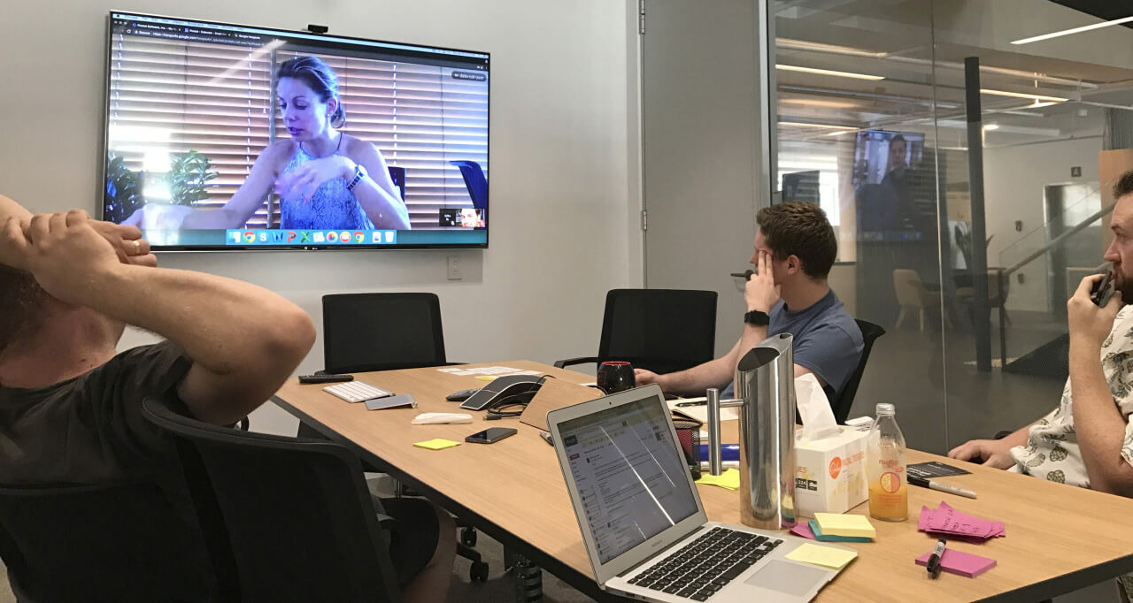
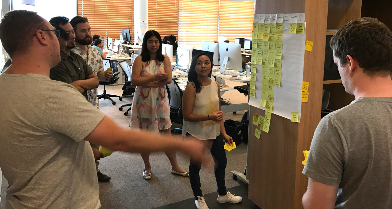
Now that we knew enough about Anna and the problems she was experiencing, we were now ready to begin the Framing process of the D&F, a series of workshops with the whole team to explore possible solutions.
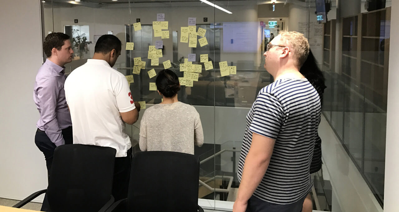
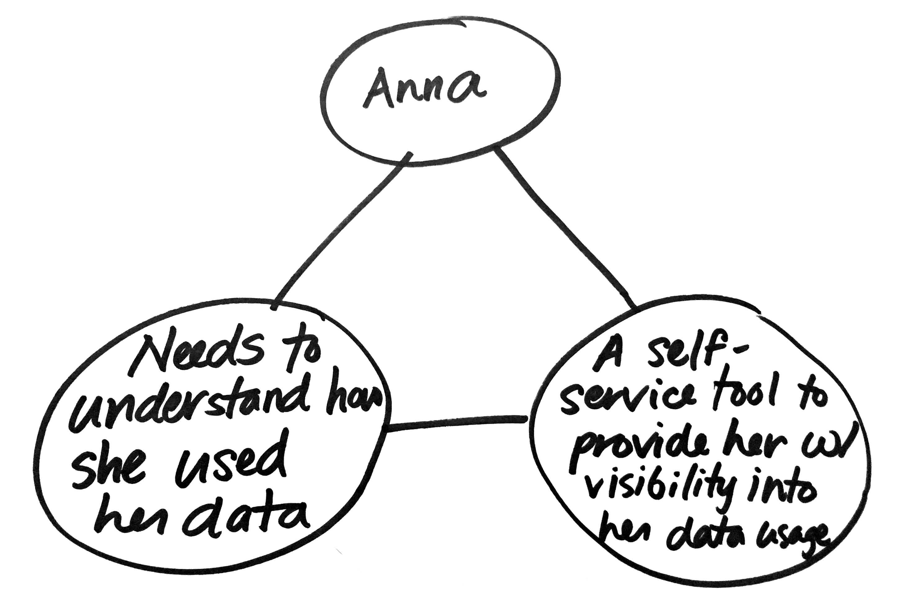
We started with a Molecule Map exercise, which aims to find product-market fit by connecting Anna, her pain point, and possible solutions at a very high-level. We generated as many possibilities as we could by listing Anna, all her problems, and all possible solutions for them. And then, as a team, we narrowed down on one direction to go with. What we ended up going with was:
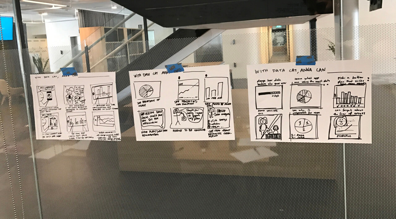
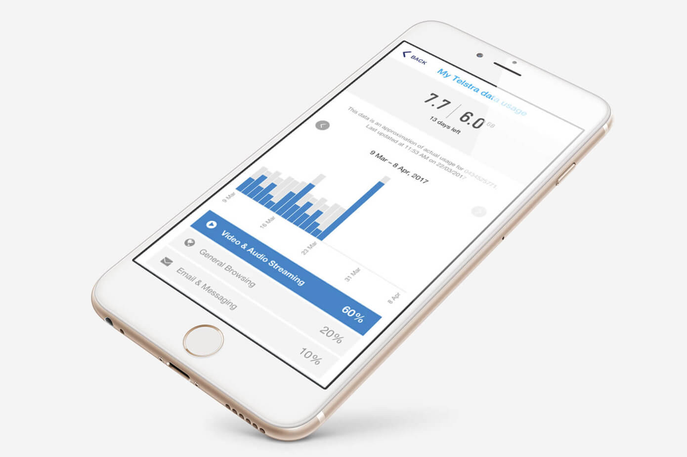
With a very high-level product direction, we were ready to start the next exercise, Value Proposition (also known as 6-up sketching). Value Proposition sketching helped the team generate moments of delight or need to build empathy, which then turned into a writing activity where we talked about the highest value this product might deliver for Anna. This activity helped us connect Anna to features in a moment when she has a need. After individually exploring possible value propositions, we collaboratively chose one value proposition out of the many to move forward with. What we went with was the following: With Data Cat, Anna can view a breakdown of her usage by category over the last 30 days and managed her excess data usage with Data Packs (data added on top of her existing plan).
Feature ideation
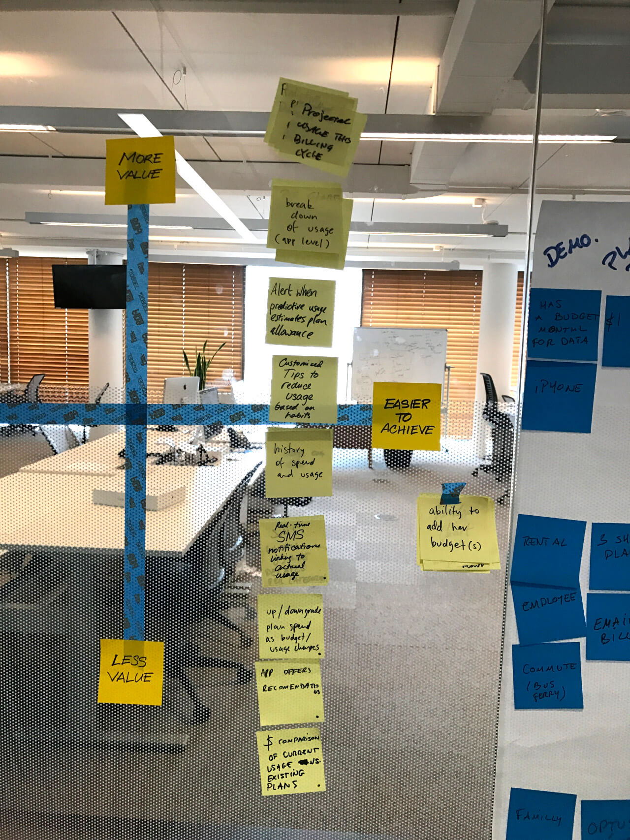
The next step was to identify and prioritise the high-level features that we'd need to deliver on the value proposition we just chose. Starting with an individual brainstorm, each member of the team listed 10 features, and then self-edited down to the 5 he felt were the most important. Each person’s 5 features were pasted on the wall against a 2x2 grid consisting of 2 axes: Value (importance to user) vs. Feasibility (ease to build). As a balanced team, we placed each feature in its appropriate quadrant, and once done, we tossed out the less valuable features (bottom half of grid).
What we were left with was a list of features that we felt were very important to Anna, but ranging between easy to difficult to achieve. These features were stack-ranked according to importance, with the most important features on top:
- Projected usage for the remainder of the current billing cycle
- Breakdown of usage at the category level
- Alert when predictive usage estimates plan allowance
- Customised tips to reduce usage based on habits
- History of spend and usage
- Real-time SMS notifications linking to actual usage
- Choice to upgrade or downgrade plan
- Recommendations
- Comparison of current usage vs existing plans
Scenario writing
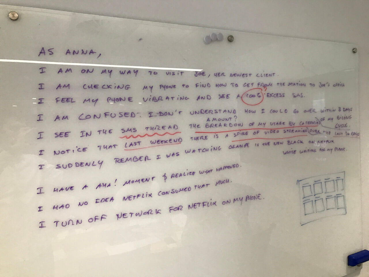
The prioritised features served as a guide for Scenario Writing, a tool we used to understand the context that Anna would be using our product. Features that didn't make it to the scenario didn’t belong in the MVP, and therefore got de-prioritised.
Design studio
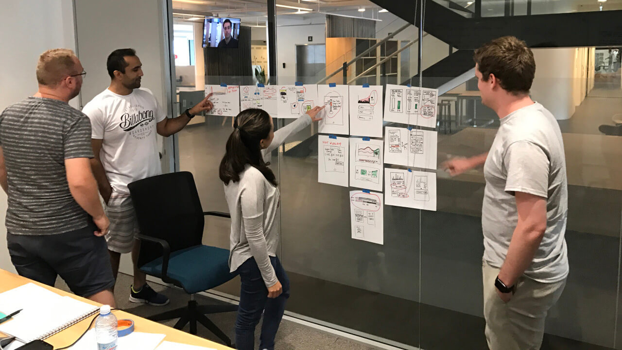
With Anna’s scenario as a guide, we were ready to start visualising the product as it fits in her life. The team gathered to do a Design Studio, a cross-disciplinary, collaborative sketching activity to ideate in the form of UI sketches. By encouraging cross-disciplinary roles to think about a problem simultaneously, we discover more unknowns than if I or my Client Designer sketched alone. It also also gave the entire team shared product ownership by having a hand in the design of the product. We worked individually at first, coming up with as many sketches as we could for any element in the scenario, and then we went around discussing the parts we liked about everyone’s work. My Client Designer and I then took the sketches for inspiration and refinement.
The validated prototype
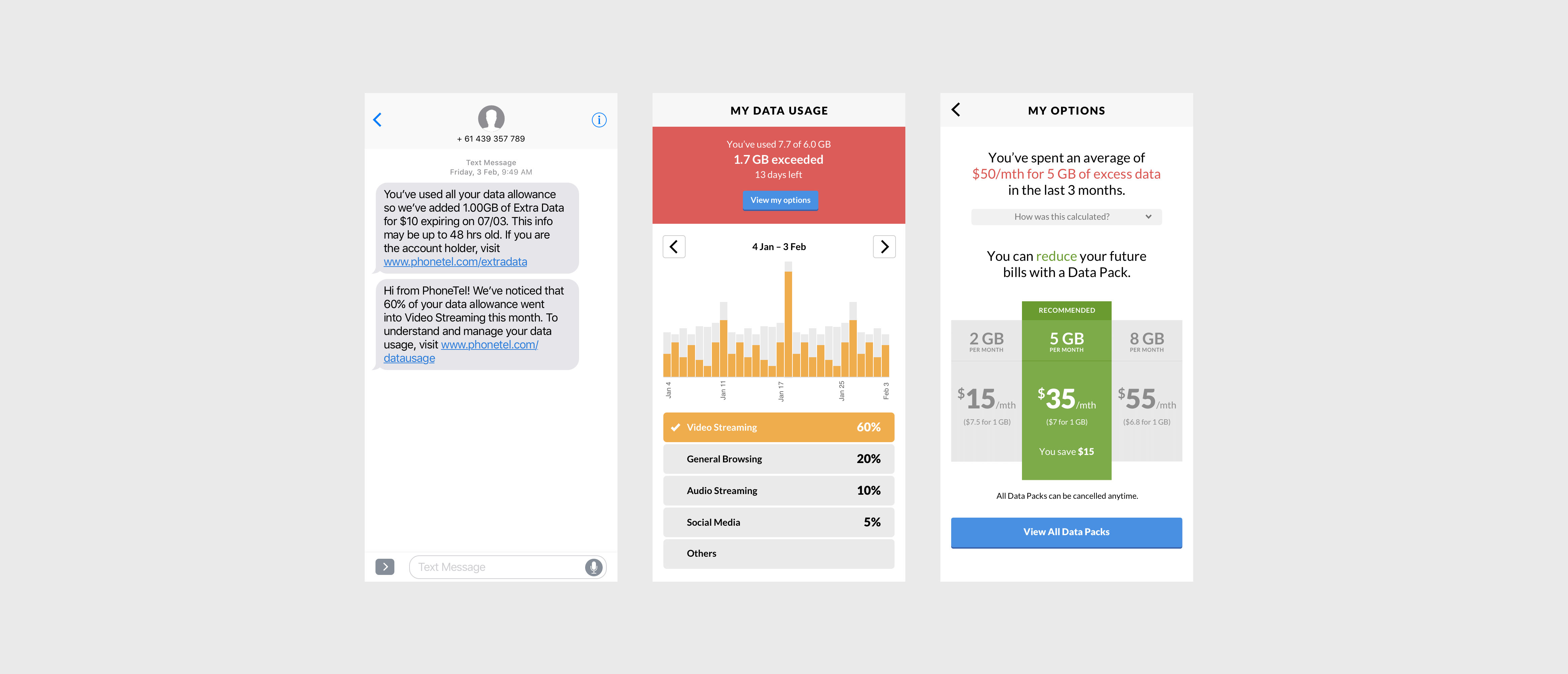
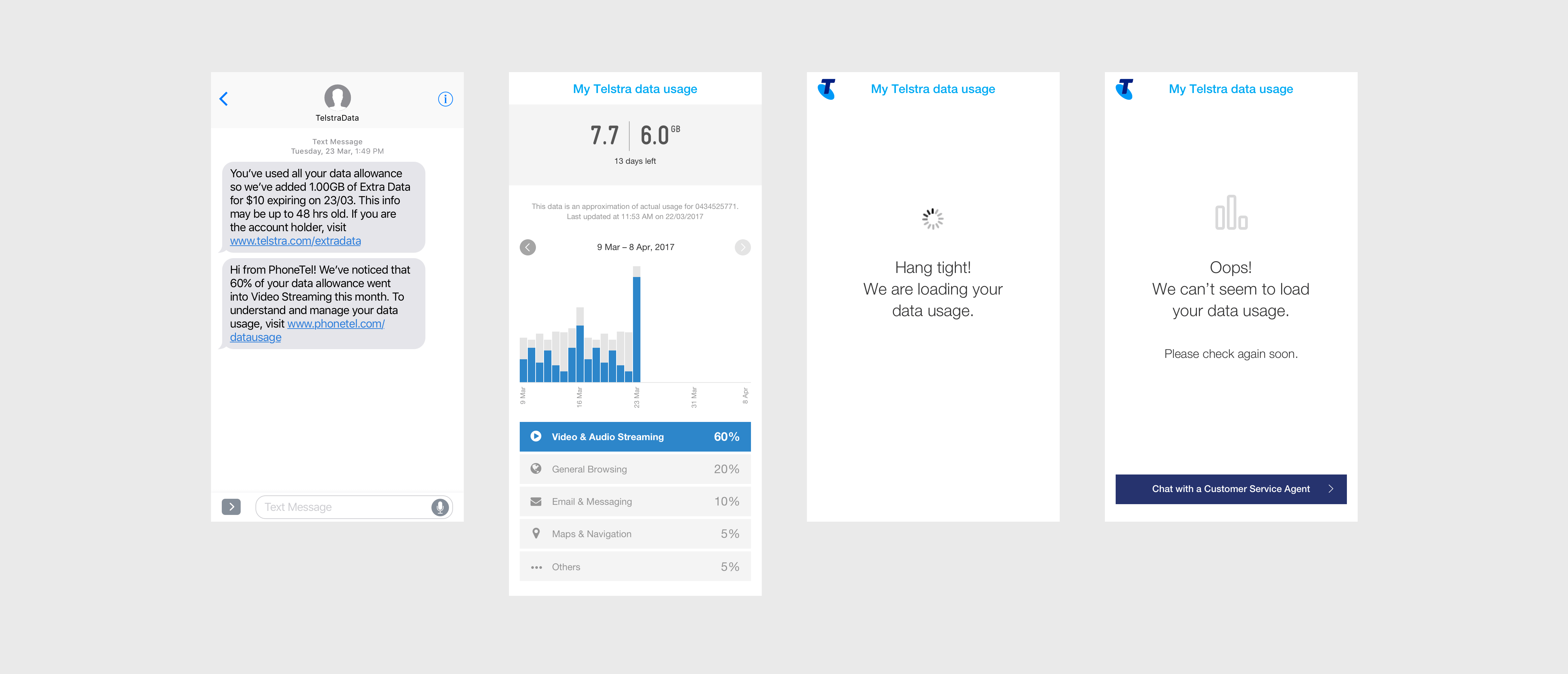
The above is the first draft of the prototype, unbranded, and relatively low-fidelity. After a Design Review with the entire team to get a sense of feasibility, what we ended up with was:
- a contextual notification tied to the SMS Anna receives when she reaches 100% of her data allowance
- a link leading to a breakdown of her usage by category over the last 30 days
- and the ability to manage her excess charges with Data Packs.
We were now ready to test the prototype with users.
Research findings
The prototype tested well and passed validation. Data Cat proved to be useful and delightful, but more thought had to be put into Data Packs. In particular, the participants questioned the estimated projected usage and felt that more historical evidence (60-90 days, as opposed to just 30) were needed for them to gain an accurate representation of typical usage. There was also a perceived lack of Data Pack options — participants felt they were herded to only one choice and were uncomfortable with not being presented with other options when they knew they existed. They also questioned whether Data Packs were the right recommendation for them as they were more interested in a one-time solution vs. a recurring solution (this month only vs. this month and future months). Overall, however, we were happy with how well Data Cat worked for Anna, and we took this as a sign we were heading in the right direction.
The shipped product
In the end, the team had to park the Data Packs idea because there wasn’t enough time in the engagement to build both Data Cat and Data Packs. Now that the product had been validated, it was now time to add a layer of visual fidelity to it. My Client Designer and I injected Telstra branding and gave the product a sleek new look after sorting out the usability kinks that were identified in the last round of interviews.
Selected Works
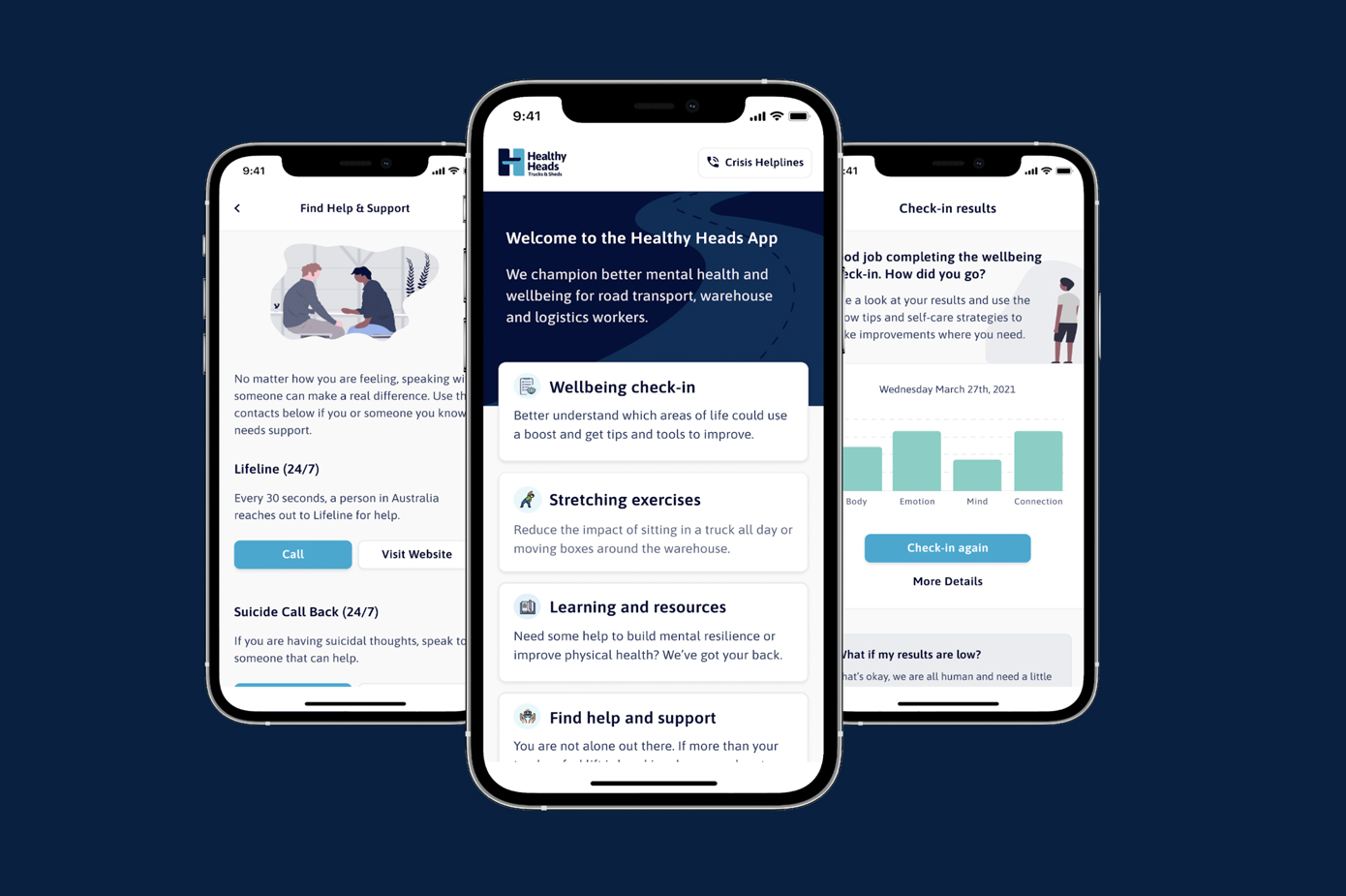
Healthy Heads in Trucks & Sheds Mobile AppMental Health

Medical Diagnostics Appointment DiaryHealthcare
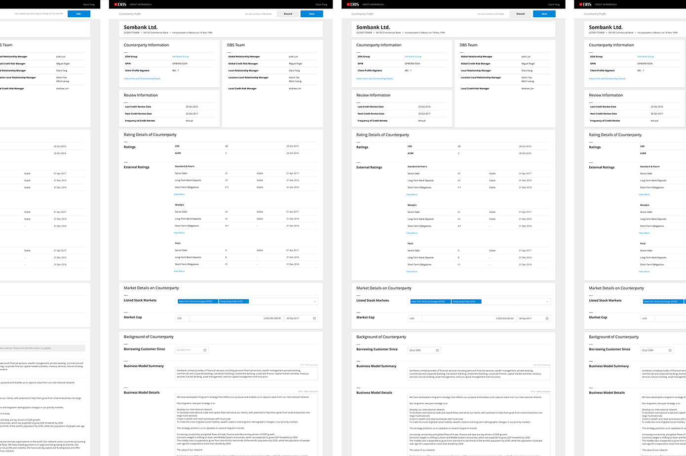
Borrower Profile Builder for Credit Origination ProcessFinancial Services
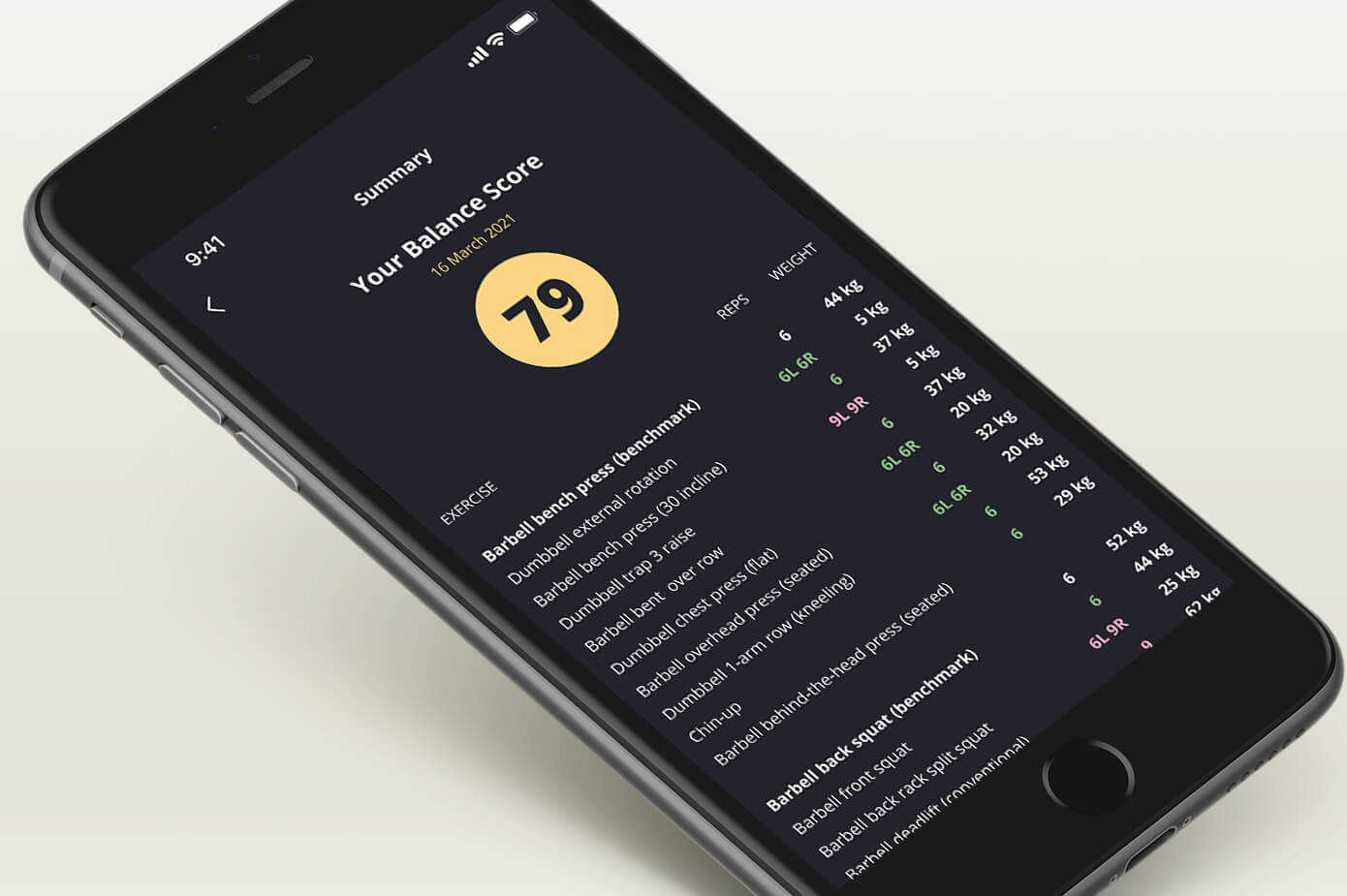
Structural Balance Testing AppHealth & Wellness
Index Engine: Manager and CalculatorFinancial Services

Fyt.club: Gamified Fitness and Wellness AppHealth & Wellness
